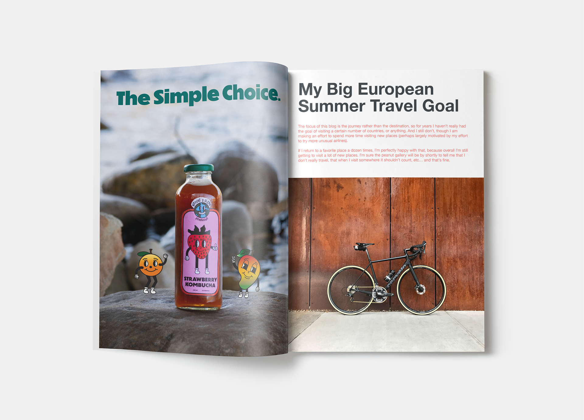
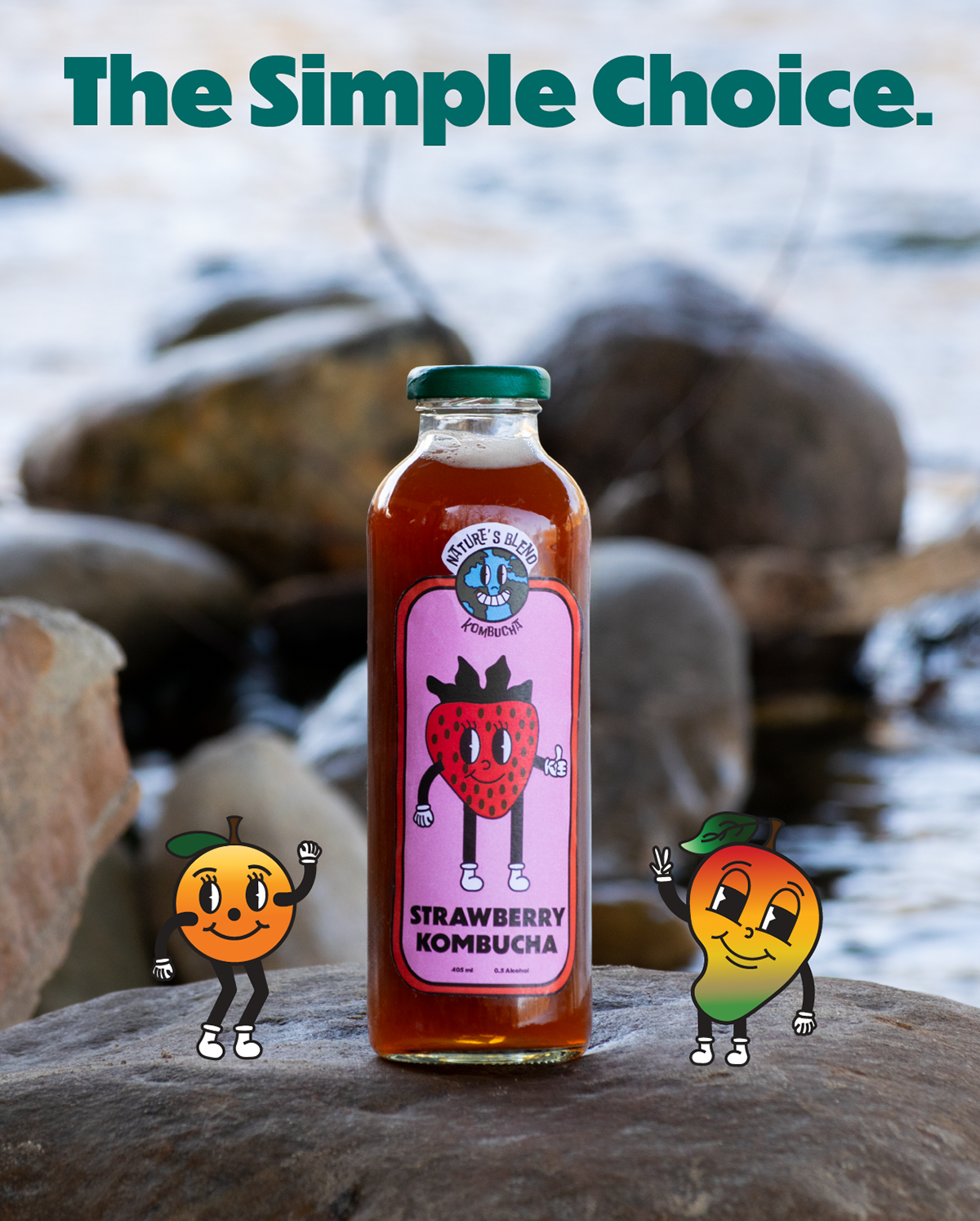
Objective: Asked to create a kombucha brand name, logo and 3 flavours with labels and to create a advertising campaign for our kombucha brand. Create a single-page magazine ad and 2 social media ads
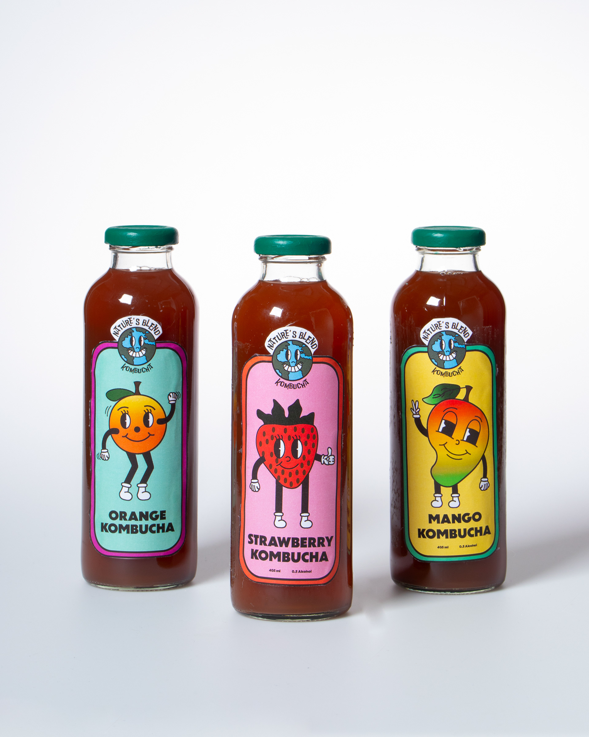
Process: The first step I took in this project was research. I examined various existing kombucha brands and their labels, and I quickly noticed a trend: most of them had a minimalistic design, often lacking in color or excitement. I wanted to break away from this norm by adding more vibrancy and energy to the design. To do this, I drew inspiration from brand mascots and decided to align these characters with the fruit flavors, creating a playful and dynamic visual connection. While I aimed to infuse the design with fun elements, I still wanted to maintain an earthy, natural feel to reflect the brand’s organic ethos. I chose a bright, bold color palette to bring excitement to the labels and incorporated fruit mascots to add personality and flair. At the same time, I kept the logo grounded in nature by using an earth symbol and paired it with an organic, eco-friendly typeface. For the bottle caps, I selected green, a color commonly associated with nature, and used it in the magazine ad for consistency. Overall, I feel I successfully rebranded the kombucha line, striking a balance between eye-catching design and the brand’s natural, eco-conscious values. This approach not only appeals to new consumers but also preserves the essence that loyal customers value.