Objective: Create An original toy blister packaging for a toy for your choosing.
Process: For this project, I selected one of my favorite characters from DC Comics, Batgirl, and aimed to capture the essence of the Batman: The Animated Series from the 1990s in my design. The goal was to pay homage to Bruce Timm’s iconic illustration style, which has become synonymous with that era. To ensure the packaging would stand out on store shelves, I used Batgirl’s signature bright purple and yellow as the primary color scheme. These colors not only reflect her character’s vibrancy but also help to catch the consumer’s eye. The character illustration was created entirely in Adobe Illustrator, allowing me to maintain sharp, clean lines reminiscent of the animated style. For the ‘Batgirl’ logo, I used a combination of Adobe Illustrator and Photoshop to faithfully recreate the original logo while adapting it for modern use. I also carefully selected a typeface that complemented the aesthetic of the animated series, while integrating the Gotham City skyline to evoke the atmosphere of the show’s setting.
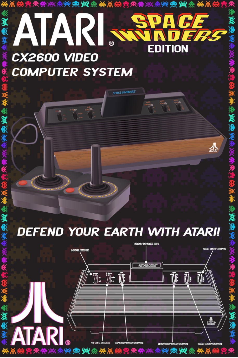
Objective: To visually capture the nostalgia and innovation of Atari, blending retro pixel art with modern design to celebrate the evolution of gaming in a bold, eye-catching way.
Process: In this project we were tasked with creating a Atari promotional poster, and illustrating the Atari itself only using Adobe Illustrator. I chose space invaders as the promotional game for this poster, as i saw it gave me the most opportunity to make a creative poster design. The most challenging aspect of this project was creating the Atari game system in illustrator, i had never done a illustration this detailed or large only using a digital program so it was a learning opportunity for me. I am very happy with how my illustration turned out, and think it looks very realistic. I enjoyed taking the Atari logo and putting my own style on it, as well as modifying the space invaders characters into my poster design.

Objective: To visually interpret the lyrics through dynamic illustrations, enhancing the emotional depth of the music and creating a visual story that resonates with fans long after the gig.
Process: For this project I chose the song “Monkey Wrench” by the Foo Fighters, as I saw a lot of potential for illustrating this song. My first idea was the go the literal route and illustrate an angry monkey playing the guitar, but then i decided a different literal image that made more sense which is a actual monkey wrench, mixed with an electric guitar. I did the illustration for the wrench and lyrics in Adobe Illustrator. One challenge I was having with this project was conveying the emotion of the lyrics through typography. The song has a very grungy-angry feeling to it and no matter what colours or typefaces i tried nothing was getting that emotion across so I decided it would be best to scan in my concept drawing and create a custom type face that i thought fit the song.